Theming
The Digidentity SDK is built with our own UI components, native on both iOS and Android. By default the SDK will fit right in with the OS, while looking like a toned-down version of the Digidentity brand. This means that out-of-the-box the SDK will be presented to your users with an interface they might be familiar with from other Digidentity interactions.
However, our UI components also offer extensive theming that allow you to match the SDK user interface to the style of your client app, creating a more seamless experience when switching between your app’s screens and the SDK. Using a simple JSON file you can define the colors, text styles, and dimensions of all Digidentity SDK screens and UI components. The JSON file is the same for Android and iOS, even though some values are platform specific. An example of the configuration.json file.
Colors
The colors section of the JSON file defines the colors of the UI. Each color has a name describing the element it applies to, and contains two colors defined as a HEX code. One for when the device is in light mode and one for when in dark mode. If your app does not support light and dark mode, you could choose to use the same colors for light and dark in the configuration.
You can define colors for backgrounds, borders, text, and more. Below as sample from the JSON file, where each item is defined with as HEX value:
"colors": {
  "backgroundColor": {
    "light": "#FDF8F1",
    "dark": "#000000"
  },
  "navigationBackgroundColor": {
    "light": "#083F3B",
    "dark": "#083F3B"
  },
  "textTitleColor": {
    "light": "#D8F85D",
    "dark": "#D8F85D"
  },
  "textPrimaryColor": {
    "light": "#083F3B",
    "dark": "#D7EEFF"
  },
  "textActionColor": {
    "light": "#56C8BB",
    "dark": "#56C8BB"
  },
  "separatorColor": {
    "light": "#F0E8DD",
    "dark": "#24716B"
  },
  "primaryButtonBackgroundColor": {
    "light": "#D8F85D",
    "dark": "#D8F85D"
  },
  "primaryButtonBorderColor": {
    "light": "#D8F85D",
    "dark": "#D8F85D"
  },
  "primaryButtonTextColor": {
    "light": "#083F3B",
    "dark": "#083F3B"
  },
  "infoAlertBackgroundColor": {
    "light": "#D7EEFF",
    "dark": "#004678"
  },
  "infoAlertBorderColor": {
    "light": "#4589BA",
    "dark": "#4589BA"
  },
  "infoAlertTextColor": {
    "light": "#004678",
    "dark": "#D7EEFF"
  },
  "loginCardItemBackgroundColor": {
    "light": "#56C8BB33",
    "dark": "#56C8BB33"
  },
  "accountSwitcherBackgroundColor": {
    "light": "#FFFFFF",
    "dark": "#083F3B"
  },
  "accountSwitcherIconFirstCircleColor": {
    "light": "#D5F1EE",
    "dark": "#A7E0DA"
  },
  "accountSwitcherIconSecondCircleColor": {
    "light": "#D6FFEC",
    "dark": "#A0DCC0"
  },
  "accountSwitcherIconThirdCircleColor": {
    "light": "#CBF2DF",
    "dark": "#7EBC9E"
  },
},
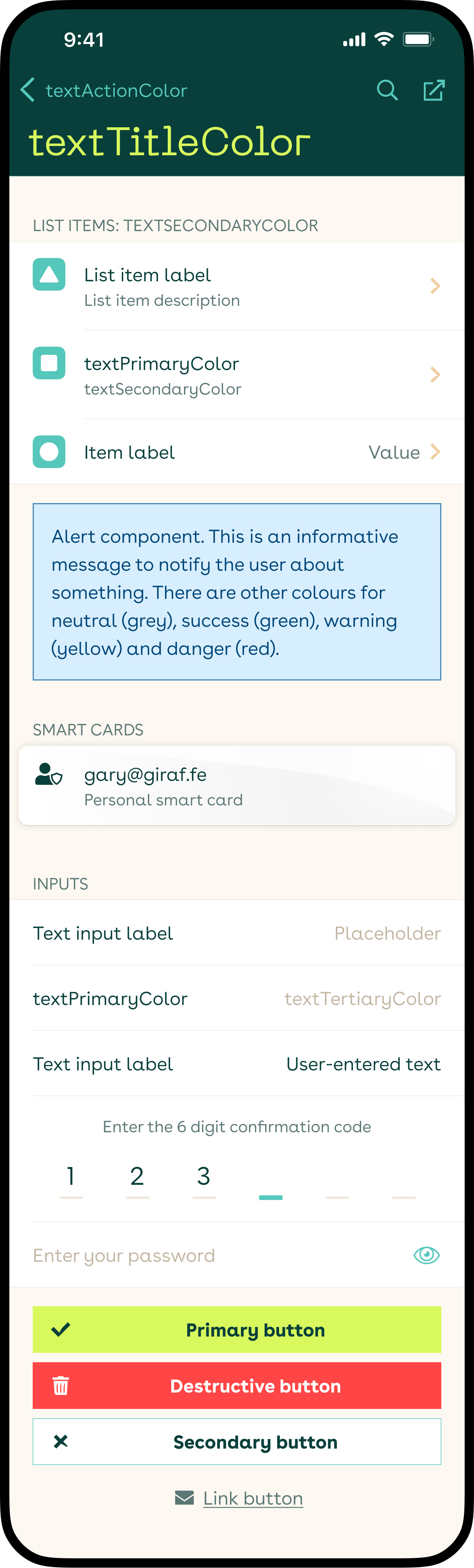
Let's take the sample JSON above, and the screenshot, and go through some examples from top to bottom.
The backgroundColor defines the colors of the background of all screens, so behind the UI elements. Then navigationBackgroundColor defines the background color of the iOS navigation bar, or action bar on Android, while textTitleColor defines the color of the title inside that navigation/action bar.
All strings across the SDK is defined with textPrimaryColor for the main text, textSecondaryColor for hints, values and descriptions, and textTertiaryColor for placeholders.
textActionColor defines the color of buttons in the navigation bar, but also many other actionable labels and icons, like the show/hide password icon button, and the active cursor in the numeric input. The colors of the icons in the list items are primarily defined by a combination of listItemIconColor and listItemIconAltColor.
Then there is the primary button UI component (primaryButton…). It can be customised with a background color, a border color and a text color, to match your client app’s primary buttons. You can also define the border width with primaryButtonBorderWidth and the corner radius with buttonBorderRadius, each from the Dimensions below. Other buttons in use are for primary destructive actions (destructiveButton…), and secondary buttons for other options (secondaryButton…). The link button uses textSecondaryColor.
The alert components come in several types: informative (blue), neutral (grey), success (green), warning (yellow), and danger (red). Each with a background (…AlertBackgroundColor), border (…AlertBorderColor) and text color (…AlertTextColor) you can define. Though you can define your own colors for there, we recommend to not deviate too much from the mentioned colors, since green is often associated with a successful status, and red with negative for example.
navigationSeparatorColor is used for the border below the navigation/action bar, and separatorColor for all other borders and lines, like between list items and as inactive cursors on the numeric input.
Dimensions
The dimensions section of the JSON defines certain numeric values for UI elements. You can define the width of borders, the radii of buttons and alerts and more. Below a sample from the JSON file, where each item is defined with as numeric value:
"dimensions": {
  "borderWidth": 0.5,
  "borderRadius": 0,
  "buttonBorderRadius": 0,
  "primaryButtonBorderWidth": 0,
  "destructiveButtonBorderWidth": 0,
  "secondaryButtonBorderWidth": 0.5,
  "lineHeightMultiplier": 1.3
},
borderWidth defines the width of border for several components, including the border below the navigation bar, between list items, and around alerts. Each type of button (primary, secondary, and destructive) can have its own border width with …ButtonBorderWidth. If your buttons should not have a border, you can either set their …ButtonBorderWidth to 0, or change their …ButtonBorderColor to match …ButtonBackgroundColor in the colors section.
borderRadius defines the corner radius of alerts and modal dialogs, and use buttonBorderRadius to define the corner radius of all button types at once. Defining a radius per button type is currently not possible.
While used a lot in the SDK, we recommend leaving the spaceXXS-spaceXXXL values unchanged. These define the margins and paddings across all screens and components, and changing these might have unintended consequences.
Finally, lineHeightMultiplier defines by what value the font size should be multiplied to get the line height on iOS. More on that below.
Text Styles
The textStyles section of the JSON defines all the styles, including fonts, for all text in the SDK. You can define the font family, the font size, line height and the font weight. While colors and dimensions have descriptive names, the text styles leave some clarity to be desired. We are working on a better naming scheme. For now the names use a scale from textXXXSBold to textHeroBold, with some exception (e.g. iOSNavBarSmallTitle and androidNumpadDigits).
Below a sample from the JSON file:
"textStyles": {
  "iOSNavBarSmallTitle": {
    "fontFamily": "Neue Machina",
    "size": 16,
    "lineHeight": 24,
    "style": "Regular"
  },
  "androidNumpadDigits": {
    "fontFamily": "Buenos Aires",
    "size": 26,
    "lineHeight": 40,
    "style": "Book"
  },
  "textSRegular": {
    "fontFamily": "Buenos Aires",
    "size": 16,
    "lineHeight": 24,
    "style": "Book"
  },
  "textSMono": {
    "fontFamily": "Source Code Pro",
    "size": 16,
    "lineHeight": 24,
    "style": "Regular"
  },
  "textXSBold": {
    "fontFamily": "Buenos Aires",
    "size": 14,
    "lineHeight": 20,
    "style": "Bold"
  }
},
Each text style has a:
fontFamily(string) defining the name of the font you want to use for that style. The corresponding font file needs to be included for this to work.size(numeric) defining the font size of the characters.lineHeight(numeric) defining the line height per text style on Android. Usually a little higher than the font size. On iOS a newer system was developed (that Android will implement too), that uses thelineHeightMultipliermultiplier from thedimensionssection applied to the font size. So if the multiplier is 1.5 and the font size is 16, for line height will be 16*1.5=24pt.style(string) defines the font weight, and also needs to match the included font files. Options could be “Regular”, “Book”, “Bold”, “SemiBold”.
textSRegular is the most used and primary text style and size used throughout the SDK. It is the text in list items, text input labels and inputs. textSBold is used mostly for buttons, and some highlighted text. And textXSRegular is used for list item descriptions and hints, and in the alerts component.
textHeroBold is used for the title in the large navigation bar size on iOS, and iOSNavBarSmallTitle for the small/scrolled size. textMBold is for the Android action bar title.
Though you could choose to set all styles to a single font family, it is recommended to at least use (or include) a monospace font for textSMono and textXLMono. These are used to display a long code hash or two-factor authentication codes respectively; elements where it is important for the user to distinguish 0 from O. We chose the open-source monospaced “Source Code Pro” to be bundled with the SDK for this.
Platform-specific styles
There are a couple of definitions in the configuration JSON that are not (yet) used by the SDK, or are only used by either the Android or iOS version of the SDK.
Android specific
On Android the dimensions > lineHeightMultiplier is not yet used. There, the textStyles > [style] > lineHeight of each text style is used instead to define the line height. See also Text Styles.
textStyles > textMBold is used for the action bar title on Android. This style is not used in the iOS SDK.
Android also does not yet use documentCameraViewOverlay colors for the ID upload camera overlays. Instead it is sharing the cameraViewOverlay colors with the QR code scanner views for now.
androidStatusBarBackgroundColor and androidNavigationBarColor are used to define the background colors of the Android status bar at the top, and OS’ system navigation bar at the bottom.
For Android we created a custom numeric keyboard (numpad) to prevent insecure 3rd party keyboards from hijacking the user’s PIN code. textStyle > androidNumpadDigits is used to define the text style of the digits in this numpad’s buttons.
iOS specific
Opposite of Android, on iOS the textStyles > [style] > lineHeight of each text style is no longer used. Opting for dimensions > lineHeightMultiplier instead to define the line height of all text styles by a same multiplier.
On iOS, textStyles > iOSNavBarSmallTitle is used to define the text style of the title on the small navigation bar. For the large navigation bar, we use textStyles > textHeroBold for the title. Neither styles are used on Android.
documentCameraViewOverlay colors are used to define the ID upload camera overlays, while cameraViewOverlay colors are only used for the QR code scanner views.